Creating a website or brand that captures and retains attention is a challenge, but it doesn’t have to be. Ever wonder why some websites seem easier to read and navigate than others? The secret to both issues may lie in a simple, tried-and-true design layout known as the F-pattern. By understanding its principles, you can guide user attention effectively and unlock a treasure trove of benefits for your web design and branding efforts.
What is F-Pattern?
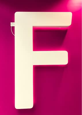
The F-pattern in web design captures the natural eye movement of readers scanning a webpage. Researchers first identified this pattern through heat map studies that tracked where people look when they read online. The pattern reveals that users usually scan in a shape that resembles the letter ‘F’. First, they read across the top of the content area, forming the F’s upper bar. Next, they scan across a shorter horizontal area lower on the page, making the F’s lower bar. Finally, they scan vertically down the left side of the content, creating the F’s spine. This is also called F-reading.
This pattern aligns with how many people learn to read: from left to right and top to bottom, F-reading. That’s why the left side of the page usually gets more attention—our eyes naturally seek the beginning of the line.
Why F-Pattern Matters in Web Design
Focusing on the F-pattern in design allows you to present information in a manner that is intuitively consumable, reducing the effort needed for users to find what they are looking for.
By aligning content with the F-pattern, the readability of your webpage improves. This leads to a more engaging user experience, potentially reducing bounce rates and increasing the time spent on the page.
Knowing how eyes naturally move allows designers to strategically place the most important information and calls to action in areas that will most likely capture attention. The F-pattern is a form of information hierarchy, which we usually picture as a pyramid. But there are other ways, like the f-pattern and z-pattern.
Importance in Branding
The F-pattern isn’t just beneficial for website content; it’s crucial for branding as well. By placing your brand’s logo or key messages within the ‘hot zones’ of the F-pattern, you can enhance brand visibility and recognition.
Understanding the F-pattern in webdesign also helps in planning the layout of branded materials like brochures or digital ads. This can impact how a potential customer engages with your brand.
Global companies like Amazon and Google are great examples. Their homepages are designed in a way that guides users’ eyes naturally through content, leading them to important actions they want users to take.
Elements of an Effective F-Pattern Design
Understanding the F-pattern in web design and branding isn’t merely about recognizing the pattern itself; it’s also about identifying the elements that fit into this layout for optimum effectiveness. These key components include headers, sub-headings, text blocks, and imagery and multimedia. Let’s dive deeper into how each of these elements can be strategically used to capitalize on the F-pattern’s strengths.
Headers
Headers serve as one of the most vital elements in an F-pattern layout. They are usually placed on the topmost horizontal line, making them the first point of contact between the user and the website. This area is where you should display the most crucial pieces of information—be it your brand name, logo, or primary navigation options.
Sub-headings
Sub-headings often lie on the second, shorter horizontal bar of the ‘F’. These can be used to break up text and introduce new sections, making it easier for users to scan the content.
- Keep sub-headings concise yet descriptive
- Use hierarchy to differentiate between main headers and sub-headings
- Consider employing keyword-rich sub-headings for better search engine visibility
Text Blocks
The vertical portion of the F-pattern—the ‘spine’ if you will—is where text blocks often reside. This layout allows you to present content in a way that aligns with natural eye movement, thereby encouraging vertical scanning down the left side of the page.
Imagery and Multimedia
Images, videos, and other multimedia elements should be positioned carefully to either break up text or further emphasize key points.
How to Implement F-Pattern in Web Design
Visual elements like images, videos, and interactive media play an essential role in the F-pattern layout. They not only serve to break up text blocks but can also emphasize key points, add aesthetic appeal, and even guide the eye toward specific calls to action.
By understanding the purpose and optimal placement of these elements within the F-pattern layout, you can create a web design or branded material that not only looks good but also functions effectively in guiding the user’s eye and attention. This comprehensive approach to the F-pattern allows you to fully harness its power in achieving better engagement, readability, and overall user experience.
Practical Steps for Layout
- Place the most critical elements like logo and navigation menu along the top horizontal bar.
- Use the second horizontal line to introduce sub-topics or features.
- The vertical bar is where your content should reside, segmented by sub-headings, bullet points, and images.
A/B Testing
After implementing, always validate your design by running A/B tests to gauge the F-pattern’s effectiveness in achieving your desired results.
How to Implement F-Pattern in Web Design and Branding
Applying the F-pattern to your web design or branding materials requires more than just theoretical knowledge; it demands practical action. Below are elaborated steps, recommendations, and considerations for successfully implementing this powerful design strategy.
Practical Steps for F-Pattern Layout in Web Design
Implementing the F-pattern starts with laying down a robust framework. Modern tools like Adobe XD, Sketch, and Figma are ideal for creating wireframes that adhere to the F-pattern layout.
Key Elements to Position
- Place the most critical elements, such as the logo and navigation menu, along the top horizontal bar.
- Use the second horizontal line to introduce secondary topics or features, possibly in a submenu or highlighted area.
- The vertical bar on the left is prime real estate for your core content, ideally segmented by sub-headings, bullet points, and images.
Additional Considerations
- Be mindful of the ‘fold.’ Content above the fold will get the most attention, so prioritize accordingly.
- Use color and contrast to guide the eye towards key areas and calls to action.
- Make sure your design is responsive, ensuring the F-pattern’s efficacy across various devices.
A/B Testing: The Crucial Validation Step
Once you’ve applied the F-pattern layout to your design, it’s vital to validate its effectiveness. A/B testing allows you to do just that by comparing two versions of a webpage or branding material to see which performs better in terms of your specific goals, whether it be click-through rates, conversions, or user engagement time.
How to Conduct A/B Testing
- Create two versions: one with the F-pattern layout and another with a different layout.
- Use analytics tools to measure performance metrics.
- Analyze the data and make informed decisions for further optimization.
Implementing F-Pattern in Branding Materials
The F-pattern isn’t confined to web design; it can also be effectively applied to various branding materials like business cards, brochures, and even logo design.
Principles for Branding
- Place your logo or brand name in areas where eyes naturally drift, like the top-left corner.
- Use hierarchy in textual content to draw attention to essential information.
- Incorporate imagery strategically to support and enhance the textual content.
Case Studies: Real-world Examples of F-Pattern Success
Several companies across various sectors have successfully employed the F-pattern in their web and branding designs.
In Web Design
For instance, news websites frequently use the F-pattern to arrange headlines along the top bar, with sub-headlines and main content following the natural flow of the pattern. This approach has been credited with significant improvements in user engagement and increased time spent on the site.
In Branding
Brands that use the F-pattern in printed materials have also noted improved metrics. For example, brochures designed with this pattern have led to higher engagement and better retention of information, ultimately leading to increased inquiries or sales.
In summary, implementing the F-pattern in both web design and branding involves a series of calculated steps, from layout planning to A/B testing for validation. Its flexible nature allows it to be applied across various platforms and materials, offering a cohesive and effective design strategy that has been proven to enhance user experience, engagement, and conversion rates.
Common Mistakes to Avoid
While the F-pattern is powerful, it’s not foolproof. Here are some pitfalls to steer clear of:
- Overloading the F-zone with too much information can overwhelm users.
- Ignoring mobile design could render your F-pattern ineffective, as mobile browsing often involves different scanning behaviors.
- Not testing with real users can result in a design that looks good on paper but performs poorly in practice.
Conclusion
Mastering the F-pattern gives web designers and branding experts a strategic edge. By aligning your design with how users naturally scan and engage with content, you create not just visually appealing but also highly effective digital and print assets. This design approach acts as a roadmap for maximizing visibility and user interaction, from headers and sub-headings to text blocks and multimedia elements.
But the F-pattern offers more than just a theoretical framework; it delivers measurable results. Through A/B testing, you can fine-tune your design to achieve specific goals like higher engagement rates or increased conversions. Its flexibility also extends its utility across different branding materials, making it a universally effective design strategy. In short, the F-pattern is not just a design choice; it’s a pathway to better user experience and stronger performance metrics.
FAQ
What is the F-pattern in Web Design?
The F-pattern refers to the natural eye movement of users as they scan a webpage. Identified through heat map studies, the pattern shows that users typically read content in a shape that resembles the letter ‘F’. They first read horizontally across the top, move down the page to read another shorter horizontal section, and finally scan vertically down the left side of the content. This is also called F-reading.
Why is the F-pattern Important for Web Designers and Branding Experts?
Understanding the F-pattern allows designers to place key elements where users are most likely to see them. By aligning a design layout with how people naturally read and scan content, designers can create more effective, user-friendly websites and branding materials.
How Do I Implement the F-pattern in My Web Design?
To implement the F-pattern, place the most crucial elements like the logo and navigation menu along the top horizontal bar. Use the second horizontal line for secondary topics or features. The vertical bar on the left is ideal for your core content, divided by sub-headings, bullet points, and images.
Can the F-pattern be Applied to Other Forms of Branding?
Yes, the F-pattern can be applied beyond web design to various branding materials like business cards, brochures, and even logo design. The key is to place the most important information where users are most likely to look first, such as the top-left corner.
How Can I Validate if the F-pattern is Effective for My Design?
After applying the F-pattern to your design, run A/B tests to validate its effectiveness. Create two versions of your webpage or branding material, one using the F-pattern and one using a different layout. Measure performance metrics like engagement rates or conversions to assess which layout performs better.