
The brands you recognize in a heartbeat rarely earn that recognition through a clever logo alone. More often, it is color doing the quiet work. A specific red, a particular blue, a warm sand tone repeated across every touchpoint until your audience feels it before they read a single word. Choosing a branding color palette is one of the most consequential decisions a conscious creator or entrepreneur will make, because color shapes emotion, memory, and trust long before your message lands. In this guide, we walk through the psychology, the anatomy, twenty ready-to-use palettes with hex codes, and the 2026 accessibility standards that keep your colors working for everyone.
A branding color palette is a deliberately chosen set of colors that a brand uses consistently across its logo, website, packaging, and marketing to express its identity and shape how people feel about it. It typically includes a primary color, one or two secondary colors, an accent color, and neutral tones, each assigned a specific role. The goal is recognition: the same colors, used the same way, every single time.
- A branding color palette is a fixed set of colors with assigned roles, primary, secondary, accent, and neutral, used consistently to build recognition.
- Color can improve brand recognition by up to 80%, according to research summarized by the University of Loyola, Maryland.
- Most strong palettes use three to five core colors, then expand with tints, shades, and tones for flexibility.
- Nearly 85% of shoppers say color accounts for more than half of what matters when choosing a product, per Colorcom research.
- Accessibility matters: WCAG 2.1 requires a contrast ratio of at least 4.5:1 for normal text so your colors stay readable for everyone.
- Start with your brand personality and audience, not trends, then test your palette across screens, print, and assistive contexts.
Why does color matter so much in branding?
Color carries meaning before words do. It reaches the emotional brain first, setting mood and expectation in milliseconds. That is why a thoughtful palette is not decoration, it is strategy. When the right colors align with your values and your audience, your brand becomes easier to remember and easier to trust. We see this every day in the branding work we do for coaches and creators.
The research backs this up. A frequently cited summary from the University of Loyola, Maryland reports that color can increase brand recognition by up to 80%. Recognition is the foundation of trust, and trust is what turns a curious visitor into a client. For a small brand competing against larger names, a distinctive, consistent palette is one of the most affordable advantages you have.
Color psychology and emotional association
Every color tells a story. Blue often signals trust, calm, and reliability, which is why so many financial and technology companies reach for it. Red carries passion, urgency, and energy, making it a strong choice for brands that want to prompt action. The key is intention: choose colors for the feeling you want to create, not simply the shades you personally like. If you want to go deeper, our guide to color psychology in design breaks down each hue.
- Yellow: happiness, optimism, and warmth. A natural fit for brands that want to feel cheerful and approachable.
- Green: growth, nature, and health. The go-to for wellness, organic, and sustainability-minded brands.
- Purple: luxury, creativity, and depth. Chosen by brands that want a sense of craft or transformation.
- Black: elegance, power, and focus. Favored by premium brands that want quiet confidence.
- Pink: compassion, playfulness, and modern warmth. Common among community-driven and creative brands.
These associations are starting points, not rules. Context, culture, and combination all shift how a color reads. A soft pastel pink feels gentle, while a hot magenta feels bold and energetic, even though both are technically pink.
How does color drive recognition and buying decisions?
Color does measurable work for a business, not just an aesthetic one. Studies consistently link color to recognition, attention, and purchase behavior. Color research compiled by Colorcom notes that nearly 85% of shoppers say color accounts for more than half of what matters when they choose a product, and that color shapes first impressions within the first 90 seconds of an interaction.
Attention follows color too. The same body of color research links a distinctive, consistent palette to stronger brand recognition and faster recall. For a creator-led brand, that means your palette is quietly working in every reel, every landing page, and every email, building familiarity over time.
What are the 20 best branding color palettes with hex codes?
The strongest palette is the one that fits your brand, yet inspiration helps you see what is possible. Below are twenty curated branding color palettes, each with its hex codes, ready to test in your own designs. Use them as starting points, then adjust the proportions and add neutrals to make them yours. As you browse, notice how each combination sets a distinct mood.
1. Wonderful Cave
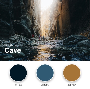
The Wonderful Cave palette pairs deep cave blues (#011826, #305973) with a warm earthy brown (#a67437). It evokes mystery, exploration, and the quiet wonder of nature, a strong fit for brands that want a profound, grounded identity.
2. Orange Dunes
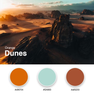
Orange Dunes captures sunlit sand at golden hour through graduated oranges (#d96704, #f2a663, #a65233). It signals a brand that is dynamic, warm, and adventurous, ideal for creators who want to radiate optimism and energy.
3. Submarine Temperature
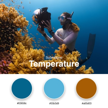
Cool oceanic blues (#03658c, #55b3d9) meet a contrasting warm amber (#a65d03) here. The result balances depth and calm with a touch of warmth, giving a website a serene yet engaging presence.
4. Sky with Sand
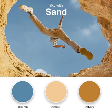
Expansive sky blue (#5687a6) meets comforting sandy beige (#f2c894, #bf7f30) for a palette that feels reliable and serene. It suits brands rooted in calm, nature, and trust, a quiet nod to peaceful coastal landscapes.
5. Europe Feelings
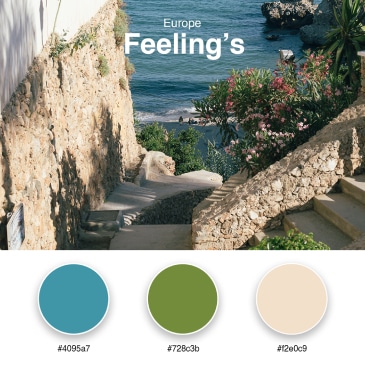
A sophisticated mix of coastal blue (#4095a7), countryside green (#728c3b), and neutral cream (#f2e0c9). It carries tradition, diversity, and continental elegance, fitting for brands that value heritage and craft.
6. Tropical Blue
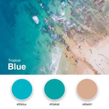
Clear tropical waters (#00b5ca, #03a6a6) with a hint of sun-kissed peach (#d9ab91). This palette conveys relaxation, lightness, and a perpetual vacation feeling, great for wellness and lifestyle brands.
7. Turkey Landscape
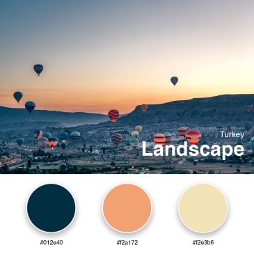
Deep ocean blue (#012e40), sun-kissed peach (#f2a172), and soft beige (#f2e3b6) capture diverse landscapes, from pristine beaches to historic architecture. It works for brands built on depth and cultural richness.
8. Delicious Orange
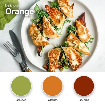
Olive green (#9ba646), bright orange (#d97823), and deep rust (#8c2703) burst with flavor and energy. This palette suits brands that want creativity, playfulness, and a sense of festive warmth.
9. Colorful Kiwi
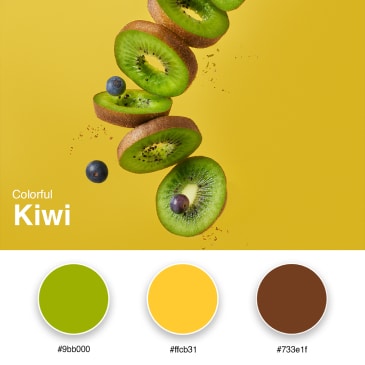
Bright lime (#9bb000) and golden yellow (#ffcb31) over a grounding brown (#733e1f). Fresh and lively, it signals growth, vitality, and innovation, a burst of energy for forward-looking brands.
10. Vintage Purple
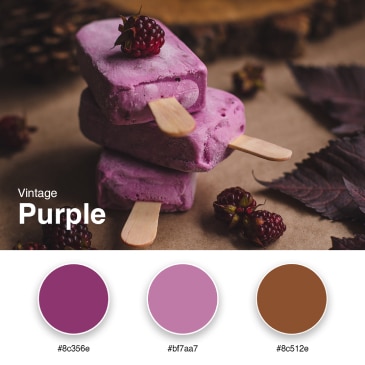
Plum (#8c356e) and soft mauve (#bf7aa7) blend with warm brown (#8c512e) for vintage charm with modern elegance. It merges the nostalgic and the contemporary in one cohesive look.
11. Bold Red
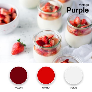
Deep maroon (#73020c) and vivid red (#d90404) against crisp white (#f2f2f2). This striking, high-contrast palette is for brands that want to make a confident statement and stay memorable.
12. Enchanted Night
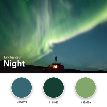
Mystical teal (#366873), deep forest green (#144033), and sage (#83a66a) evoke calm, wonder, and nighttime quiet. It suits brands that value depth and a sense of the contemplative.
13. Sunflower Yellow
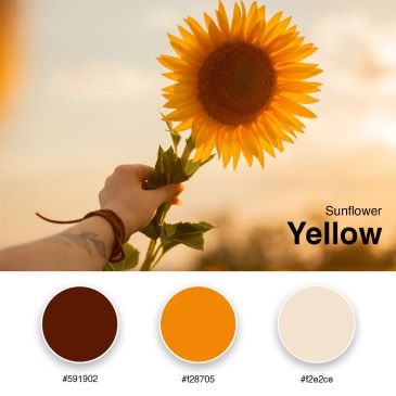
Deep brown (#591902), bright marigold (#f28705), and warm cream (#f2e2ce) feel as cheerful as a field of sunflowers. This palette radiates optimism, happiness, and approachable warmth.
14. Pink Mountains
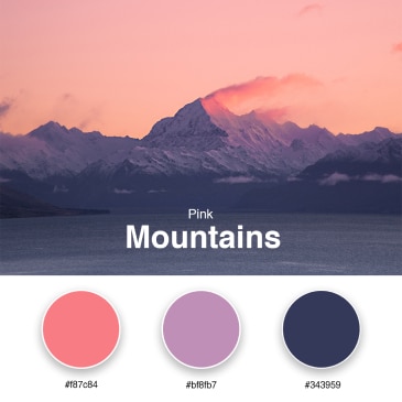
Coral pink (#f87c84) and soft lavender (#bf8fb7) meet a deep, contemplative navy (#343959). Tender yet strong, it balances gentleness with resilience, fitting for compassionate, modern brands.
15. Pink Lilies
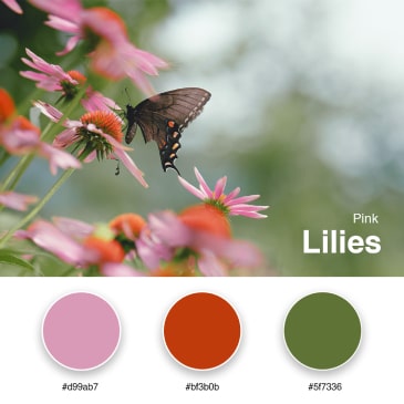
Soft pink (#d99ab7) juxtaposed with bold rust (#bf3b0b) and olive green (#5f7336). It conveys beauty, elegance, and the wild heart of nature, a striking blend of soft and earthy.
16. Black and Grey Nature
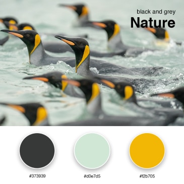
Charcoal grey (#373939) and pale mint (#d0e7d5) with a pop of radiant yellow (#f2b705). Modern and minimal with just enough vibrancy, it suits sleek, contemporary brands.
17. Colorful Feather
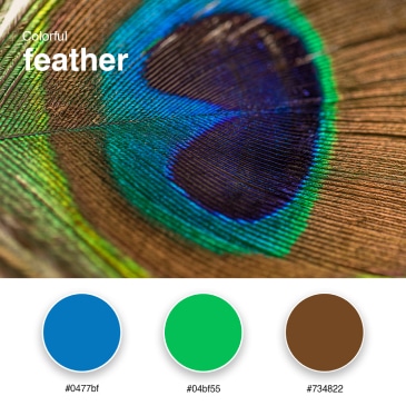
Bright blue (#0477bf) and vivid green (#04bf55) paired with rustic brown (#734822). Lively and fresh, it celebrates creativity and freedom, a playful fit for expressive brands.
18. Winter Blue
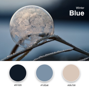
Near-black navy (#0f1926) and muted steel blue (#7c92a6) with warm taupe (#d9c7b8). Cool and calming, it captures the elegance of a pristine winter landscape, ideal for refined, quiet brands.
19. Micro Yellow
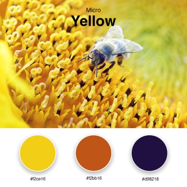
A gradient of sunlit yellows (#f2ce16, #f2bb16) into warm amber (#d98218). Warm and invigorating, this palette signals energy, innovation, and sunny optimism.
20. Colorful Greece
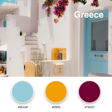
Mediterranean azure (#96ccd9), sunlit orange (#f29f05), and deep wine (#730237) capture the spirit of Greece. It conveys history, warmth, and a touch of luxury, a journey through culture and time.
What is the anatomy of a brand color palette?
A palette is not a random pile of colors, it is a structured system where each color has a job. Most well-built palettes follow a simple proportional logic: a dominant primary color anchors the brand, secondaries add range, an accent draws the eye to key actions, and neutrals hold everything together. Getting these roles right is what separates a cohesive brand from a chaotic one. Our brand strategy process always starts here.
Primary colors
These are the dominant colors most associated with your brand. You will use them across your logo, your website background, and your core marketing. Primary colors set the overall tone, so they should align closely with your values and the feeling you want to create.
Secondary colors
Secondary colors add depth and variety. They break up monotony and create layers in your design without competing with the primary. Use them in backgrounds, supporting graphics, or section dividers to keep things visually interesting and balanced.
Accent colors
Accents are used sparingly but strategically. They draw attention to the things that matter most, like call-to-action buttons, links, and special offers. A good accent contrasts clearly with your primary and secondary colors so it stands out the moment it appears.
Neutral colors
Neutrals such as whites, blacks, greys, and beiges give your other colors room to breathe. They handle body text, backgrounds, and spacing, keeping the palette from feeling overwhelming. Strong neutrals are what make a brand feel clean and professional.
Tints, shades, and tones
Beyond the core colors, a complete system includes tints (color plus white), shades (color plus black), and tones (color plus grey). These variations give you flexibility for hover states, gradients, and detailed graphics while staying within your brand family. They keep your design cohesive even as it grows more complex.
How do you build an accessible, WCAG-compliant palette?
Accessibility is no longer optional, it is a 2026 standard that protects both your audience and your reputation. The Web Content Accessibility Guidelines (WCAG) 2.1 require a contrast ratio of at least 4.5:1 for normal text and 3:1 for large text against its background. Around one in twelve men experiences some form of color vision deficiency, per the National Eye Institute, so contrast and clarity are essential, not cosmetic.
The good news is that accessible palettes are also more effective palettes. High contrast improves readability, comprehension, and conversion for everyone, not only people with visual impairments. When we build a brand website, accessibility and beauty are designed together, never traded against each other.
Practical steps to keep your palette accessible
- Test every text-on-color pairing with a free contrast checker before you commit. Aim for 4.5:1 or higher on body text.
- Never rely on color alone to convey meaning. Pair color with icons, labels, or underlines so links and states are clear to all viewers.
- Check your palette in grayscale. If two colors look identical without hue, they may be indistinguishable to someone with color blindness.
- Build accessible accent pairs. Keep a high-contrast text color ready for use on top of your accent, so buttons stay legible.
- Document the rules. Note which color combinations are approved for text in your brand style guide so the standard holds over time.
How do you choose and implement your brand colors?
The best palette starts with your brand, not a trend. Begin with your personality, your values, and the feeling you want your audience to have, then choose colors that express that. Implementation is where many brands lose consistency, so a clear system matters as much as the colors themselves. Below are the practices we rely on with clients, especially in our branding for coaches work.
Start with personality and audience
Ask what you want people to feel, then work backward to color. A calm, trustworthy coaching brand leans toward grounded blues and warm neutrals, while an energetic creative brand might reach for vivid accents. Always consider your audience and the cultural meanings colors carry for them.
Create a brand style guide
Document your palette with exact codes for every context: HEX for web, RGB for screens, and CMYK for print. A style guide keeps your colors identical everywhere they appear, which is what builds recognition over time. Include the rules for which colors pair with text.
Limit your core colors
Stick to three to five core colors, then expand with tints, shades, and tones. Too many colors make a brand feel scattered and dilute recognition. A focused palette is easier to apply consistently and far more memorable.
Test across mediums
Colors shift between screens, printers, and lighting. Test your palette on multiple devices and on printed samples to make sure it holds its impact everywhere. What looks vivid on your laptop can look muddy on a phone or a business card.
Stay consistent, stay flexible
Consistency builds trust, yet brands evolve. Keep your core identity stable while allowing room to expand the palette thoughtfully as you grow. Any change should be intentional and aligned with your brand, never a reaction to a passing trend.
What are the most common branding color mistakes?
Even thoughtful brands stumble on color, usually in predictable ways. The most common mistake is using too many colors, which scatters attention and weakens recognition. Research on first impressions suggests audiences form a judgment within about 90 seconds, and an estimated majority of that assessment is based on color alone, so clarity matters more than variety.
Using too many colors
A crowded palette confuses your message and makes design feel cluttered. Resist the urge to add a color just because it looks nice. Discipline, not abundance, is what makes a brand instantly recognizable.
Ignoring cultural meaning
Colors carry different associations across cultures. White can mean purity in one context and mourning in another, and red can signal prosperity or caution depending on the region. If you serve a global audience, research how your colors are read before you commit.
Chasing trends over timelessness
Trend colors feel exciting, then date quickly. Choose colors that reflect your enduring values, not just this year’s palette. A timeless foundation with a flexible accent layer lets you stay current without rebranding every two years.
Forgetting accessibility
Beautiful colors that fail contrast standards exclude part of your audience and quietly hurt conversion. Always check readability. Accessibility and aesthetics are partners, not opposites, and the brands that honor both earn deeper trust.
Frequently Asked Questions
What is a branding color palette?
A branding color palette is a deliberately chosen set of colors a brand uses consistently across its logo, website, packaging, and marketing. It usually includes a primary color, secondary colors, an accent, and neutrals, each with a defined role. The purpose is recognition, building familiarity and trust through repetition.
How many colors should a brand color palette have?
Most strong palettes use three to five core colors, then expand with tints, shades, and tones for flexibility. A focused set is easier to apply consistently and far more memorable than a crowded one. The goal is a clear hierarchy of primary, secondary, accent, and neutral colors, not maximum variety.
Why does color matter so much in branding?
Color shapes emotion, memory, and trust before words register. Research summarized by the University of Loyola, Maryland reports that color can improve brand recognition by up to 80%, and nearly 85% of shoppers say color accounts for more than half of what matters when choosing a product. A consistent palette is one of the most affordable competitive advantages a small brand has.
How do I make my brand color palette accessible?
Follow WCAG 2.1 guidance: aim for a contrast ratio of at least 4.5:1 for normal text and 3:1 for large text. Test every text-on-color pairing with a contrast checker, never rely on color alone to convey meaning, and check your palette in grayscale to confirm it works for people with color vision deficiency.
Can I change my brand colors over time?
Yes, brands evolve and so can their palettes. Any change should be intentional and aligned with your core identity, so you stay recognizable through the transition. Update your style guide, refresh your touchpoints consistently, and give your audience context for the shift rather than changing colors abruptly.
What is the best tool for building a color palette?
Free generators and contrast checkers make the process easier and more accessible. They help you explore combinations, lock the colors you love, and confirm your pairings meet readability standards. Whatever tool you use, document the final HEX, RGB, and CMYK values in a style guide so your palette stays consistent everywhere.
Your colors are one of the quietest, most powerful tools your brand owns. When they are chosen with intention, structured with clear roles, and built to be accessible, they do years of recognition work on your behalf. If you would love a thoughtful partner to shape a palette and brand identity that feels like you and converts with grace, we would be honored to help, you can explore our brand strategy work or learn how we support a brand consultant approach for conscious creators and entrepreneurs.