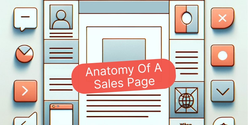
Anatomy of a Sales Page: Every Section That Drives Conversions
A high-converting sales page is not a wall of text with a buy button at the bottom. It is a carefully engineered sequence of psychological triggers, trust signals, and clear communication that moves a visitor from curiosity to commitment. After building 500+ websites and sales pages for coaches, consultants, and conscious entrepreneurs at Lovepixel Agency, we have seen firsthand which sections actually move the needle and which ones just take up space.
This guide breaks down every section of a sales page that matters, backed by conversion data, so you can build (or rebuild) a page that does its job.
What Makes a Sales Page Different from a Landing Page?
According to Involve.me’s 2026 landing page report, the average landing page converts at 6.6% across industries, but sales pages for premium services and coaching programs often outperform that benchmark when built with intention. The key difference is purpose: a landing page captures a lead, while a sales page closes a sale.
A landing page typically asks for an email address in exchange for a free resource. A sales page asks for money. That distinction changes everything about how you structure the content, the length of the page, the depth of objection handling, and the number of trust signals you need.
For coaches and conscious entrepreneurs, this matters because your offer usually requires more explanation than a simple product purchase. You are selling transformation, not a widget. That means your sales page needs to do more heavy lifting in building trust, painting the outcome, and removing hesitation.
Citation: A sales page differs from a landing page in one critical way: it must close the sale, not just capture a lead. This requires deeper objection handling, more social proof, and a benefit-driven structure that guides visitors from awareness to purchase decision.
How Important Is the Headline on a Sales Page?
Research compiled by Keywords Everywhere (2025) shows that an optimized headline can increase conversions by up to 307%, making it the single highest-impact element on your entire page. Yet only 20% of visitors read beyond the headline, according to the same data, which means those first 8-12 words carry enormous weight.
Your headline needs to accomplish three things simultaneously: identify who the page is for, name the transformation or outcome, and create enough curiosity or urgency to keep reading. For coaching sales pages, that often means leading with the result your clients want rather than the process you offer.
Headline formulas that work for coaches:
- Outcome + Timeframe: “Build a Fully Booked Coaching Practice in 90 Days”
- Problem + Solution: “Stop Trading Time for Money: The Group Coaching Model That Scales”
- Specific Result: “The Exact System Our Clients Use to Generate $10K Months”
Avoid vague headlines like “Transform Your Life” or “Unlock Your Potential.” These say nothing specific and give visitors no reason to keep reading. At Lovepixel, we test headlines across every funnel we build because the data consistently shows this is where the biggest conversion gains live.
What Is the Ideal Structure of a High-Converting Sales Page?
Data from First Page Sage’s 2026 funnel benchmarks shows that structured sales funnels with clear stage progression convert at 2-3x the rate of unstructured pages. The anatomy of a sales page follows a specific psychological sequence, and skipping sections or rearranging them typically hurts performance.
Here is the proven structure, in order:
- Headline + Sub-headline: Capture attention and state the core promise
- Opening hook: Agitate the problem your audience feels right now
- Value proposition: What you offer and why it is different
- Social proof block: Testimonials, logos, case study snippets
- Benefits section: What the buyer gets (outcomes, not features)
- How it works: Simple 3-step process breakdown
- Detailed offer breakdown: Everything included, with perceived value
- Objection handling: FAQ or “Is this for me?” section
- Guarantee / risk reversal: Remove the final barrier
- Primary CTA: Clear, single action with urgency
Each section builds on the one before it. The headline creates interest, the problem agitation creates emotional investment, social proof builds trust, benefits create desire, and the CTA captures the decision. When we build sales pages and landing pages at Lovepixel, we follow this exact sequence because it mirrors how people naturally make buying decisions.
How Does the Value Proposition Drive Conversions?
According to WordStream’s 2026 CRO statistics, the top 10% of landing pages convert at 11.45% or higher, and they all share one trait: a crystal-clear value proposition positioned above the fold. Your value proposition is not your tagline. It is the specific answer to “Why should I buy this from you instead of someone else?”
For coaches and service providers, the value proposition usually lives in the gap between where your client is now and where they will be after working with you. It needs to be specific, measurable when possible, and different from what every other coach on the internet is saying.
Weak value proposition: “I help entrepreneurs grow their business.”
Strong value proposition: “We build sales pages and funnels for coaches that convert at 3-5x the industry average, so you can stop guessing and start scaling.”
The difference is specificity. The strong version names the audience (coaches), the deliverable (sales pages and funnels), the result (3-5x conversion), and the emotional relief (stop guessing).
Citation: The strongest sales page value propositions name four things: the specific audience, the deliverable, a measurable outcome, and the emotional shift the buyer experiences. Pages that nail all four consistently outperform vague alternatives by 2-3x in conversion testing.
Why Is Social Proof the Most Underused Section?
Research from Senja’s 2025 testimonial effectiveness study found that pages with testimonials convert 34% higher than those without, and products with reviews show a 270% higher purchase likelihood. Despite this, many coaching sales pages either skip testimonials entirely or bury a single quote at the bottom of the page.
Social proof works because it shifts the burden of persuasion from you to your clients. When a prospect reads that someone just like them achieved a specific result through your program, it does more persuasion work than three paragraphs of your best copywriting.
Types of social proof to include on your sales page:
- Client testimonials: Specific results with names and photos (3-5 minimum)
- Case study snippets: “Before and after” transformation stories
- Numbers and stats: “500+ clients served” or “$5M+ in client revenue generated”
- Media mentions: Logos of publications or podcasts you have been featured in
- Video testimonials: These can increase conversions by up to 80% compared to text alone, according to Teleprompter.com’s 2025 data
Place your strongest testimonial near the top of the page, right after the value proposition. Then weave additional social proof throughout the page rather than grouping it all in one section. This approach keeps trust signals active as the visitor scrolls through each stage of their decision-making process.
How Should You Write the Benefits Section?
According to Hostinger’s 2026 landing page data, 82.9% of sales page traffic now comes from mobile devices, which means your benefits section needs to be scannable, not dense. Visitors scrolling on a phone will not read three paragraphs explaining each benefit. They need visual hierarchy: bold benefit statements, short supporting text, and icons or checkmarks that create rhythm.
The distinction between features and benefits is where most coaching sales pages fall apart. A feature is what your program includes (“12 weekly group calls”). A benefit is what that feature does for the buyer (“Get real-time coaching on your biggest challenges so you never feel stuck between sessions”).
Structure each benefit as:
- Bold benefit headline: The outcome the buyer cares about
- 1-2 sentence explanation: How your offer delivers that outcome
- Supporting feature: The specific component that makes it possible
Aim for 5-7 benefits maximum. More than that creates decision fatigue and dilutes the impact of each one. Lead with your strongest benefit, the one that directly addresses the primary pain point of your ideal client.
What Makes a CTA Actually Convert?
HubSpot’s analysis of 330,000+ calls-to-action, cited by Sixth City Marketing (2026), found that personalized CTAs convert 202% better than generic defaults. That means “Start My Coaching Journey” outperforms “Submit” or “Buy Now” by a significant margin. The CTA is not just a button. It is the final piece of copywriting that either completes the sale or loses it.
CTA best practices backed by data:
- Use first-person language (“Start My Free Trial” vs “Start Your Free Trial”) for a 90% increase in click-through rate
- Place the primary CTA above the fold, which gets 304% more conversions than below-fold placement (WiserNotify, 2026)
- Use a single focused CTA per page, emails with one CTA see 371% more clicks
- Add urgency language (“Limited spots available”) for up to 332% conversion lift
- Make buttons large enough to tap on mobile, increasing CTR by up to 90%
On a coaching sales page, repeat the CTA at least three times: after the value proposition, after the offer breakdown, and at the very bottom. Each placement catches visitors at different stages of their decision process. We use this pattern across every funnel we build at Lovepixel because it consistently outperforms single-CTA layouts.
Citation: Personalized CTA buttons convert 202% better than generic ones, according to HubSpot’s analysis of over 330,000 calls-to-action. First-person phrasing like “Start My Coaching Journey” consistently outperforms second-person or generic button text across industries.
How Does Page Speed Affect Sales Page Conversions?
A study cited by Digital Thrive (2025) found that a 0.1-second improvement in page load time increased conversions by up to 10.1%. Pages loading in one second convert three times higher than pages loading in five seconds. For a sales page where every visitor represents potential revenue, speed is not a technical detail. It is a conversion variable.
Common speed killers on coaching sales pages include uncompressed hero images, embedded video players that load on page render, excessive tracking scripts, and unoptimized fonts. The fix is usually straightforward: compress images, lazy-load videos, defer non-essential scripts, and stick to system fonts or load web fonts asynchronously.
At Lovepixel, we run speed optimization as part of every website project because we have seen too many beautifully designed sales pages lose conversions to a 4-second load time. A fast page that is “good enough” will always outperform a slow page that is perfect.
How Do You Handle Objections on a Sales Page?
According to Landbase’s 2025 conversion research, 92% of consumers hesitate to purchase when no reviews are available, and similar hesitation applies to any unaddressed concern on a sales page. Every visitor who does not buy had a reason. Your job is to anticipate those reasons and address them before the visitor leaves.
The most common objections for coaching and service-based sales pages are:
- “Is this worth the investment?” Address with ROI examples, case studies, and payment plans
- “Will this work for me?” Address with testimonials from people similar to the prospect
- “What if I don’t have time?” Address with time commitments, flexible scheduling, and recorded sessions
- “Can I trust this person?” Address with credentials, media features, and years of experience
- “What if it doesn’t work?” Address with a clear guarantee or refund policy
The best place for objection handling is between the offer breakdown and the final CTA. By this point, the visitor understands what you offer and is evaluating whether to buy. An FAQ section works well here because it lets you address objections in a format that feels helpful rather than defensive.
What Role Does Mobile Optimization Play?
Fibr.ai’s 2026 landing page statistics report that 82.9% of landing page traffic now comes from mobile devices, yet desktop still converts at 4.8% compared to mobile’s 2.9%. That gap represents a massive opportunity: if your sales page is not optimized for mobile, you are losing the majority of your traffic to a poor experience.
Mobile optimization for sales pages goes beyond responsive design. It means rethinking content hierarchy for thumb scrolling, making CTA buttons large enough to tap (optimizing for mobile can improve conversions by 32.5%), ensuring images do not push key content below the fold, and reducing form fields to the absolute minimum since each additional field reduces conversions by approximately 4%.
For coaching sales pages specifically, long-form copy on mobile needs visual breaks every 2-3 paragraphs: a testimonial, an image, a stat callout, or a benefit highlight. Walls of text that work on desktop become unreadable on a phone screen.
How Do You Build a Sales Page That Reflects Your Brand?
The visual design of your sales page is not decoration. Research from Blogging Wizard (2026) shows that color psychology directly influences buying decisions, with certain colors evoking trust (blue), urgency (red), or growth (green). Your color palette, typography, and imagery should all align with your brand identity and the emotional tone of your offer.
For coaches and conscious entrepreneurs, this means your sales page should feel like an extension of your brand, not a generic template. The fonts, colors, and imagery should match your website, your social media presence, and the energy of your offer. A page that looks different from the rest of your online presence creates subconscious distrust.
Design elements that build brand trust:
- Consistent color palette (2-3 primary colors max)
- Professional photography or high-quality branded images
- Clean typography with clear hierarchy (one heading font, one body font)
- Generous white space, especially around CTAs
- Brand-consistent icons and graphic elements
If you are not sure whether your sales page design aligns with your brand, that misalignment is likely costing you conversions. At Lovepixel, we build brand-aligned websites and sales pages because coherent brand experience is one of the most underrated conversion factors.
What Should a Coaching Sales Page Pricing Section Look Like?
Pricing is where many coaches lose sales, not because the price is wrong, but because the presentation creates confusion or sticker shock. The most effective approach is to anchor value before revealing price: list everything included, assign perceived value to each component, and then present the actual investment as a fraction of the total value.
Proven pricing section structure:
- Stack the value: List each component with its standalone price
- Show the total perceived value: “Total value: $4,997”
- Reveal the actual price: “Your investment: $1,497” (or payment plan)
- Add a guarantee: Remove risk with a clear refund policy
- Include payment options: Single payment with a small discount, plus a payment plan
Tiered pricing (Basic / Pro / Premium) works well for group programs or courses where you can differentiate by access level. For 1:1 coaching, a single price with a payment plan option is usually cleaner and more effective.
How Do You Know If Your Sales Page Is Working?
The average landing page converts at 2.35% according to WordStream (2026), with top performers reaching 11.45%. For coaching sales pages, a conversion rate between 3-8% is a healthy range depending on your traffic source, price point, and audience temperature.
Key metrics to track:
- Conversion rate: Purchases or applications divided by unique visitors
- Scroll depth: How far visitors get before leaving (shows where interest drops)
- Time on page: Longer is usually better for long-form sales pages
- CTA click-through rate: Which buttons get clicked and which get ignored
- Bounce rate: The percentage of visitors who leave without any interaction
Test one element at a time. Start with the headline (highest impact), then test the CTA copy and color, then the social proof placement. Companies that regularly A/B test see dramatically better results, with over 80% of experiments showing improvement over the control version.
Citation: For coaching sales pages, a healthy conversion rate falls between 3-8% depending on traffic source and price point. The top 10% of all landing pages convert at 11.45% or higher, and they share common traits: clear value propositions, strong social proof, and personalized calls-to-action.
Frequently Asked Questions
How long should a sales page be?
The length depends on your price point and audience awareness. For offers under $500, a shorter page (1,500-2,500 words) usually works. For premium coaching packages ($2,000+), long-form pages of 3,000-5,000 words tend to convert better because higher-priced decisions require more information and trust-building. According to Involve.me’s 2026 data, pages with 10-15 content sections perform 55% better than those with fewer sections.
Should I use video on my sales page?
Yes, when used strategically. 38.6% of marketers report video as the most effective element for boosting landing page conversions, and video testimonials can increase conversions by up to 80%. Place a short video (2-3 minutes) near the top of the page to introduce yourself and your offer. Just make sure it does not auto-play and that it lazy-loads so it does not hurt page speed.
How many testimonials do I need on a sales page?
Research suggests 3-5 testimonials is the optimal range for a sales page, striking the right balance between credibility and cognitive load. Having 100+ reviews in your total library correlates with a 37% conversion increase (Trustmary, 2025). Place your strongest testimonial near the top and distribute others throughout the page near relevant sections.
What is the best CTA color for a sales page?
There is no universally “best” color, but contrast matters most. Your CTA button should visually stand out from the rest of the page. In testing, red buttons outperformed green by 21%, and blue is used by 33% of brands. The most important thing is that your CTA color contrasts strongly with your page background and aligns with your brand palette.
Can I build a high-converting sales page without a designer?
You can, but the data shows that professionally designed pages significantly outperform DIY builds. If you are bootstrapping, start with a proven template and focus on the copy: headline, value proposition, social proof, and CTA. These elements drive most of the conversion impact. When you are ready to invest, working with a team like Lovepixel Agency that specializes in conversion-focused design for coaches will typically pay for itself through improved conversion rates.
Build a Sales Page That Actually Converts
The anatomy of a sales page is not a mystery. It is a proven structure backed by data: compelling headline, clear value proposition, layered social proof, benefit-driven copy, strategic objection handling, and a focused CTA. Every section has a job, and when they work together in sequence, the page moves visitors from interest to action.
If your current sales page is not converting, odds are one or more of these sections is missing, misplaced, or underperforming. Start with the headline (up to 307% lift), add real testimonials (34% lift), and personalize your CTA (202% lift). Those three changes alone can transform your results.
At Lovepixel Agency, we have built 500+ websites and sales pages for coaches and conscious entrepreneurs. We know which sections matter, how to sequence them, and how to design them for both brand alignment and conversion performance. If you want a sales page that does its job, let’s talk.